
Product Design

Designing User Experience for Virtual Reality (VR)
May 27, 2025

I designed the interaction for a recipe-focused AI assistant inside the Xtra app, from the first question to recipe suggestions, including a jumping icon for the thinking state.

What do you do when you know what you feel like eating, but not which recipe to make? I explored a contextual AI assistant that lets people ask a simple question inside the Xtra app.
Rather than moving into a separate tool, people stay in the Recipes section. From a message such as “Ik wil pasta eten”, the assistant shows a thinking state, presents recipe suggestions and leads into a recipe detail page.
My contribution: Conversation flow, interaction states, high-fidelity screens, recipe recommendation patterns and the assistant icon's jumping animation while a response is prepared.
I began by looking at the Recipes experience itself. Instead of sending someone to a separate AI page, the assistant appears as a small entry point in a familiar part of Xtra. When opened, it keeps the person close to the recipes they were already exploring.
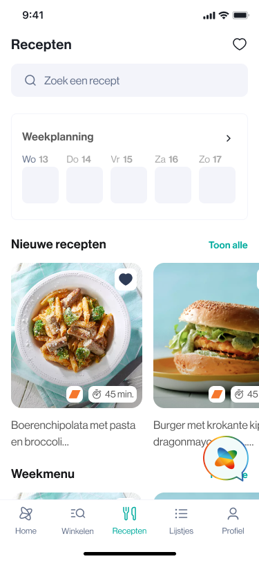
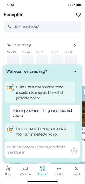
A chat experience has many moments: opening the panel, writing a request, sending it, waiting, receiving an answer and asking something new. I mapped these as separate interface states and explored multiple versions in Figma.
I kept user messages visually distinct from the assistant's replies. The input area stays clear, even when the conversation grows.
The pause before a reply matters. I designed a thinking state that gives a short message and visual feedback while the system looks for recipe ideas. I also created a small jumping animation for the assistant icon. The motion signals progress without taking attention away from the conversation.
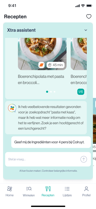
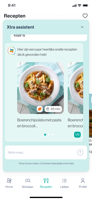
Rather than return a long text-only response, the assistant presents recipe cards inside the chat. The cards let someone scan meal ideas and browse other results in the same place. A count and carousel indicator make it clear there is more to explore.

The first answer is rarely the whole journey. In the later exploration, I added suggested follow-up questions for common needs, such as faster meals, family-friendly dishes, vegetarian ideas and ingredients for more people.
These suggestions make the next step clear. A person can refine the result without having to start a new search.
The Figma file includes early chatbot exploration, a second version and a more focused chat assistant section. I compared states and refined the layout of messages, recipe results and the input area.
Alongside the high-fidelity screens, I prepared a reconstructed concept sketch that shows the core flow: enter, ask, think and explore results. I also created a five-pose storyboard of the jumping icon. These are new visuals made to explain the work, not original discovery sketches.
The design brings the entry point, user messages, thinking feedback, recipe recommendations and follow-up questions into one connected mobile experience. Each state answers a question the user might have: Where do I start? Did my message send? Is the assistant working? What should I do next?
This portfolio case study shows the design and prototype work. It does not claim a public launch or measured improvements in time, conversion or adoption.
A compact assistant icon offers help without competing with recipe content.
Messages and the input are grouped in a single panel, with enough visual separation to follow a conversation.
A short status message and icon motion give a useful response during a delay.
Visual results sit inside the chat, with clear indicators for exploring more options.
Suggested requests reduce the effort of refining a recipe search.
The interface includes a small reminder to check important information from AI replies.
I reconstructed a process illustration from the Figma states to make the design story easier to follow. The sequence covers entry, asking a question, thinking and viewing recipe results. The images are newly created documentation visuals, not original sketches drawn during discovery.
The jumping icon is part of the thinking state I designed. A five-pose storyboard shows how the motion reads: rest, anticipation, jump, return and rest. The surrounding interface stays steady so the visual feedback does not compete with the task.
The storyboard is available as a separate PNG and SVG. The exported original motion is not attached to the CMS draft yet.
In an AI experience, the states between the question and the answer carry meaning. The user needs to know what the assistant is doing and whether the conversation is moving forward.
Keeping help inside the recipe experience was one of the most useful design choices. The chat gives people a new way to ask, while recipe cards keep the results connected to the content they already know.
The jumping icon was also a small but important detail. I wanted the assistant to feel responsive during a wait without relying on a large animation or a long explanation. This is a useful reminder that good motion starts with feedback.
geek out together about your project or upcoming product.


